In a world of kitchens that feel either museum-precious or aggressively utilitarian, this one manages to land somewhere far more elusive: design-forward, but entirely unfussy. The kind of space where you could host Thanksgiving or supervise homework in bare feet without changing the vibe.
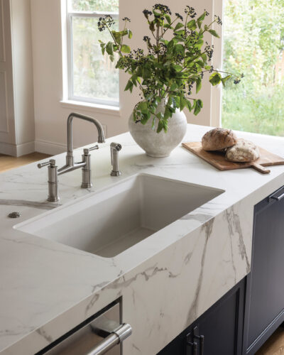
From the outset, Christine Dennison of Denver-based Dennison Interior Design knew the room had to walk that line. “I wanted this kitchen to feel calm, open, and beautiful, but also truly livable for a young family,” Christine says. That meant choosing materials that could take a hit and still look good doing it. Dekton countertops stand up to spills and heat. Faux vinyl seating wipes clean. Even the sink detail subtly protects the cabinetry below. Nothing fragile. Nothing performative.
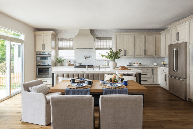
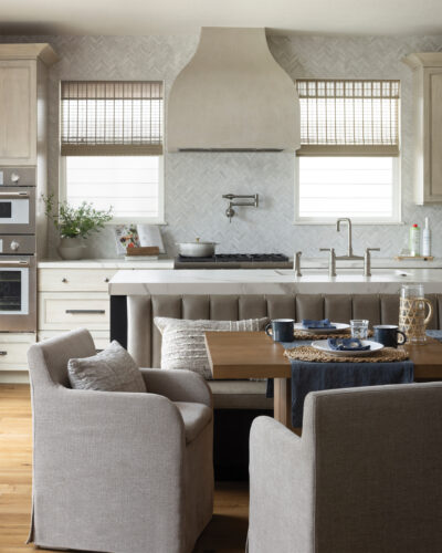
Early conversations with the homeowners made one thing clear: this was a family planning for growth. They were ready to sacrifice their eat-in nook for more storage. Christine wasn’t. “I felt strongly that they would miss having a place to sit across from each other as their family grew,” she says. So she pushed for both. The island was carefully engineered to deliver storage and seating, with bar stools at the ends and a built-in banquette anchoring the center of the room. It’s a move that shifts the kitchen from pass-through to gathering place. “Good design is not only about giving clients what they ask for,” she adds, “but also understanding what they will need next.”
Architecturally, the sculptural plaster hood steals the show. Originally tucked into a corner, the range wall lacked presence. Relocating the hood between the windows established balance and gave the kitchen a clear focus. “I believe a focal point should bring clarity to a room, not competition,” Christine says. The soft plaster silhouette plays against the cabinetry’s straight lines, introducing depth without visual noise.
The palette follows the same logic. Pale wood keeps the space airy while warm flooring and upholstery ground it. A darker painted island and gunmetal hardware add contrast in measured doses. Christine thinks in opposites: “smooth against textured, tailored against organic,” she explains, so the room feels rich without feeling busy.
Then there are the quiet triumphs. A lowered countertop creates a faux apron-front sink. Spice and utensil pull-outs flank the range. A tiered cutlery drawer and custom trash pull-out make daily life easier. None of it flashy. All of it intentional.
In the end, the magic here isn’t just in how the kitchen looks. It’s in how it anticipates life unfolding inside it.
For print-exclusive stories, download the digital magazine or pick up a copy from select local King Soopers, Safeway, Tattered Cover, or Barnes & Noble locations.


