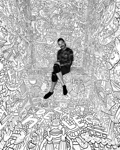
For Joe Palec, doodling in the margins was just the beginning. His signature, character-crammed line drawings now cover everything from powder bathrooms and restaurant walls to Icelantic skis. Dense and detail-driven, his style transforms everyday surfaces into themed visual mayhem—stuffed with hilarious Easter eggs. We sat down with him to learn more about his work. Here’s what he shared.
Between the lines: “As a kid, the space above the lines on my notepad was always packed with drawings, while the rest of the page seriously lacked notes. I loved creating little characters, like a hungry hamburger with ravenous eyes, or goofy caricatures of my classmates. I was definitely the class clown.”
Make it maximalist: “I would call my style extreme doodling. It’s more than just doodling since there’s so much story, depth, and layers to what I create. I love live painting, like stream-of-consciousness freehanding. But for more professional clients, I plan it out in advance.”
Connect the dots: “The goal is always to fill the space. I usually start by landing on a theme, then brainstorm a bunch of imagery around it. I begin with a light sketch, intentionally leaving some areas blank so I can come back and connect things later—like skipping a cowboy’s arm at first, then turning it into a lasso that links to the doodle beside it. That way, everything flows together as one piece.”
Static shock: “The finished piece is kind of like TV static—so visually overwhelming, it almost becomes a pattern. But the more you look, the more you realize there’s a story hidden inside. I like creating that sense of overload. Some people say it’s a headache… I say it’s brain-breaking—and I love that.”
Method to the madness: “Where’s Waldo? is a huge influence for me. Every page is packed with chaos, but nothing is random— everything has a purpose.”
Gray matters: “I’ve been thinking about adding more color to some projects, but black and white is perfect for blending one image into another. Take an apple and a basketball—when it’s in black and white, the shape can be ambiguous. But the moment I color it red or orange, it becomes one or the other. I’d rather leave that interpretation up to the viewer.”
Local lookout: “I recently did a collab with Elitch Gardens, which was a dream come true after living here for fifteen years. I always ask myself, ‘What would younger me think?’—and honestly, he’d be ecstatic. I also just wrapped projects with Little Arthur’s, King of Wings, Novel Strand Beer, Renegade… and hopefully the Denver Broncos next, for one of their game day posters.”


